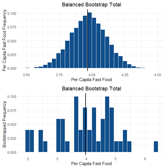
This is a plot of the fast food restaurants per capita across the US in 2018. The data comes from here. While plotting the data is cool, there is so much more we can do! This is an example of how we can apply hypothesis testing we learned in class.
Exploratory Data Analysis
First, lets look at the distribution of the per-capita. Two pictures are shown. One is the raw histogram of the 50 states, whereas the other is a bootstrap of the sample. What is a bootstrap? And why do we use it here? A bootstrap sample is where we take a sample of our data, but do not replace the data after we draw a point. In our case, after we choose a state, say Massachussetts, the state is put back in the sample for when we pick the second state, and 3rd, 4th, and so on. The issue is there are 5050 possibilities (incalcuable) to get all the possible resamplings. Not to worry, we can pick a sufficiently large number of so called "bootstrap samples" which should give us a good estimate of the "true" distribution (well maybe...again this depends on assumptions as always!). The general idea behind this is that we put more weight on the central events, and extreme events play less of a role in our statistics, which is a big problem in small data sets. We take 10000 bootstrap samples here. Here is a plot:
The plots are important because they allow us to investigate the assumptions we make when we do t-tests for example. Is the data normal? Is the variance homogeneous? Additionally, they can allow us to check that there are not any issues in the data set. For example, in this dataset, if there were a negative per-capita restaurant data-point, we know we'd have an issue. In the industry, looking at the data in these early stages of an analysis is called Exploratory Data Analysis, and is probably one of the more important and fun parts of the job.
Regional Differences
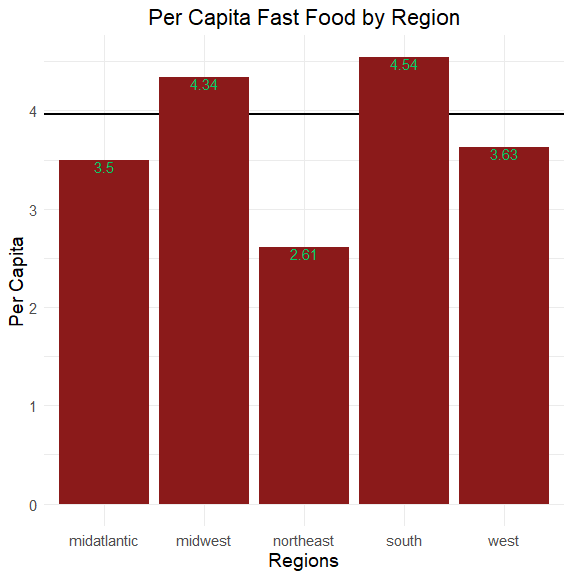
What else can we do? How about we look at regional differences. First, lets plot:

Interesting. Now, we can do chi-squared tests.
| Region | Expected | Actual |
|---|---|---|
| Mid-Atlantic | 3.72 | 3.5 |
| Midwest | 3.72 | 4.33 |
| Northeast | 3.72 | 2.61 |
| South | 3.72 | 4.54 |
| West | 3.72 | 3.63 |
Regression and Prediction
The most interesting part perhaps.
